Blue Shield of California Member Experience
Reimagining the digital experience for 4M+ members across responsive web, iOS, and Android
Key Outcomes
- Delivered a complete platform redesign for 4M+ members across web, iOS, and Android — within the constraints of an active annual enrollment period that made disrupting the live experience unacceptable
- Redesigned Blue Shield's highest-traffic member journeys — Login, Find a Doctor, Claims, Benefits, Dashboard — improving task completion and member satisfaction across core workflows
- Identified that the Benefits challenge was structural, not aesthetic — reframed the engagement from a redesign project into a long-term strategic roadmap
- The phased benefits roadmap was adopted by Blue Shield's digital leadership as their multi-year strategic direction — the highest-value deliverable of the engagement
THE BUSINESS STAKES
A Healthcare Giant Falling Behind on Digital
Blue Shield of California is a nonprofit health insurer serving over 4 million members. By the time the engagement began, their digital member experience was falling behind. Digital-native health apps were raising member expectations faster than Blue Shield's legacy platform could respond. A member portal that once differentiated their service had become a liability: fragmented, dated, and failing to meet the standards members now expected.
The mandate wasn't just a redesign. It was a signal to 4 million members that Blue Shield was serious about competing on digital experience — and a bet on a strategic direction for the next several years of platform investment.
CHALLENGES
Redesigning Under Constraints
Blue Shield was nearing their annual enrollment period, which meant we couldn't risk disrupting the live experience. We conducted extensive research into the site's existing capabilities and launched a re-skinned responsive experience along with iOS and Android apps, all within the technical confines of Blue Shield's backend services.
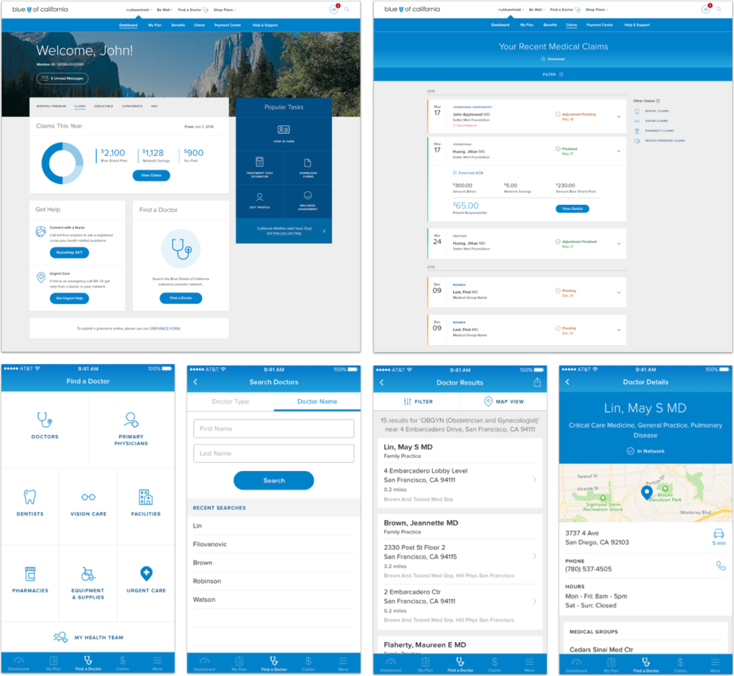
The project was structured in sprints, each focused on a core member experience: Login, Find a Doctor, Claims, Benefits, My Plan, ID Card, Dashboard, and Profile.
STRATEGY & APPROACH
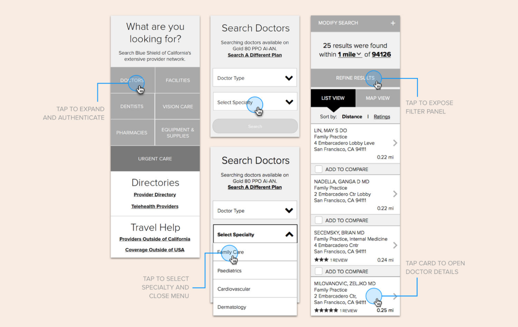
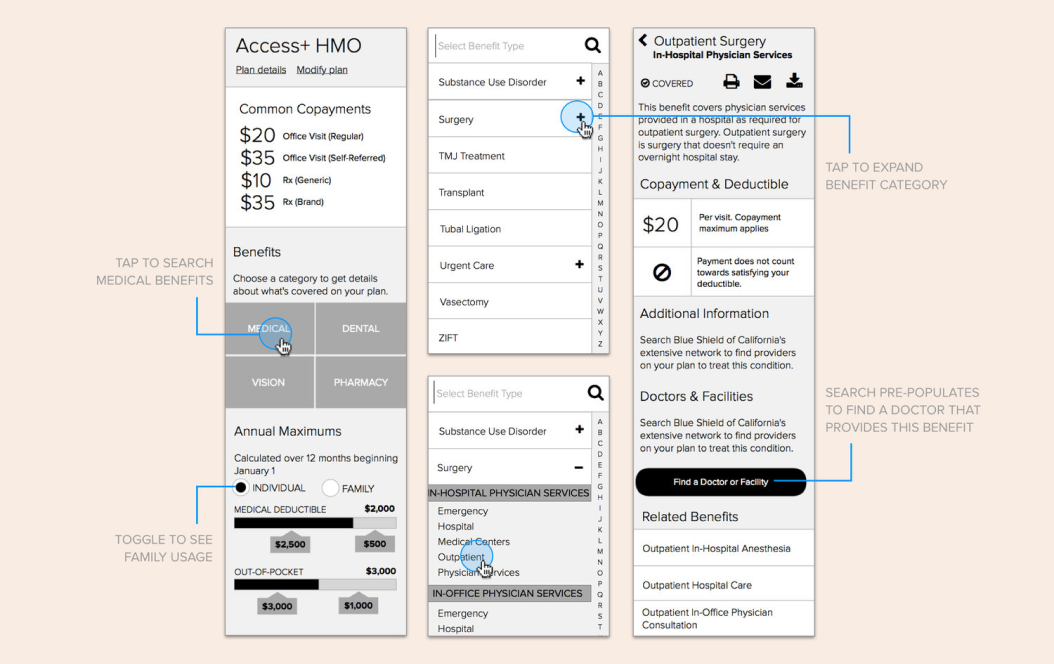
Navigation Strategy & Information Architecture
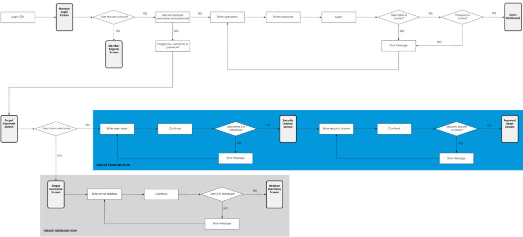
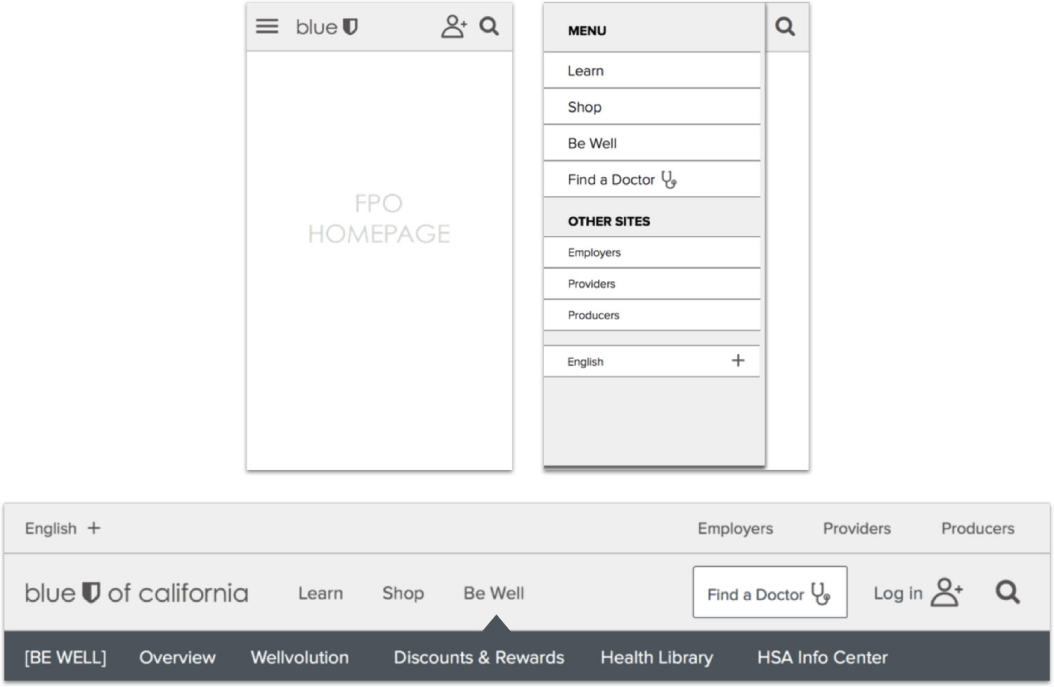
I led the development of the navigation system, page layouts, and overall digital strategy for both the responsive website and native mobile apps. Deliverables included extensive wireframes, annotations, user flows, and prototypes.
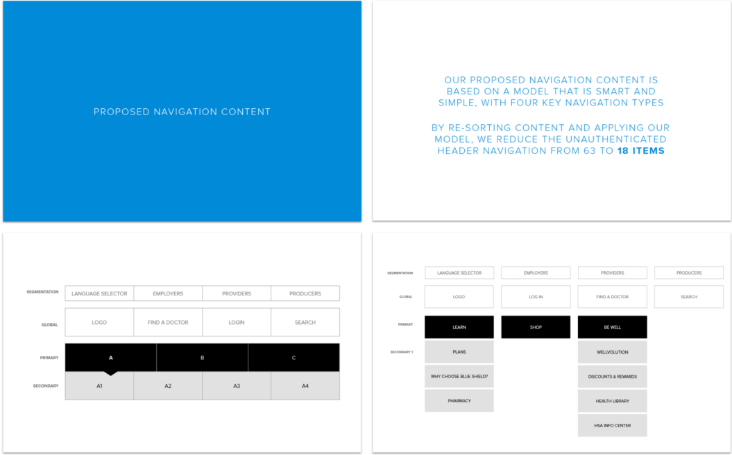
Excerpts from the Navigation Strategy
Impact
The redesigned experience helped members easily manage their plans, track claims, find benefits, and access urgent care—a significant leap forward from the fragmented legacy platform.
IMPACT & OUTCOMES
The Redesigned Member Experience
The redesigned Blue Shield experience was a significant leap forward. A reorganized navigation and intuitive design helped members easily manage their plans, track claims, find benefits, and access urgent care. The prospect experience incorporated Blue Shield's new brand positioning, more effectively guiding new customers to the right plan.
KEY DECISIONS & TRADEOFFS
The Decision That Changed the Engagement
Midway through the project, it became clear that Benefits — Blue Shield's most-visited section — had a problem that better design couldn't fix. The confusion wasn't navigational. It was structural: backend data architecture surfaced benefits in ways that made no sense to members regardless of how well we designed around it.
I made the call to separate the immediate redesign from a longer-term strategic vision. Rather than patch the experience, I proposed developing a phased roadmap grounded in realistic member scenarios — showing Blue Shield what the Benefits experience could become over three phases of investment, each buildable from the last.
That reframe changed the scope of the engagement and the value we delivered. The client had asked for a redesign. We gave them a strategic direction. The roadmap became the artifact their digital leadership adopted as the multi-year plan.
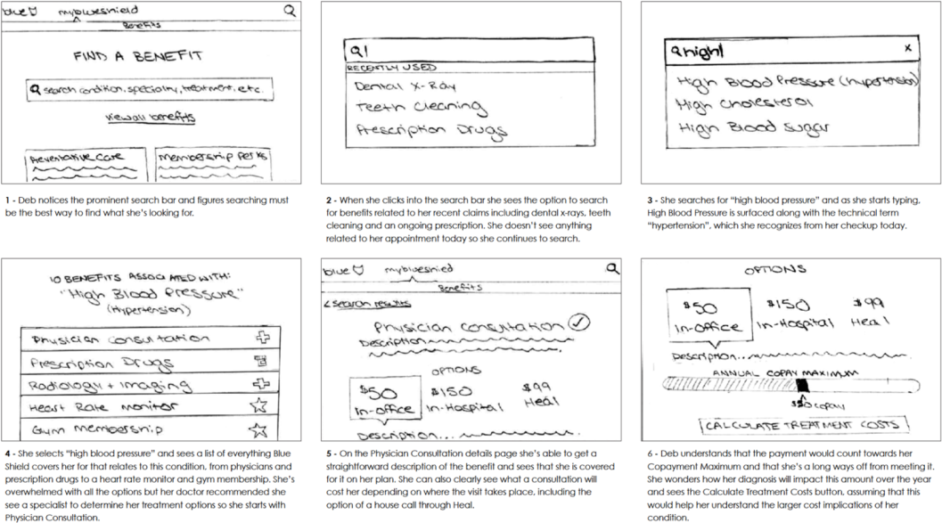
Benefits Vision Strategy
Working closely with a designer and strategist, I led research across members, competitors, and best-in-class digital experiences. We developed a phased roadmap with short, medium, and long term solutions, each grounded in a realistic member scenario that I storyboarded, sketched, and wireframed.
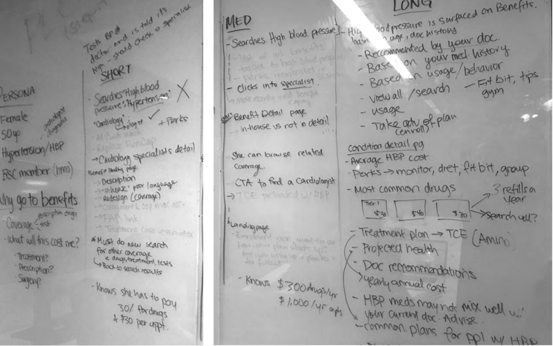
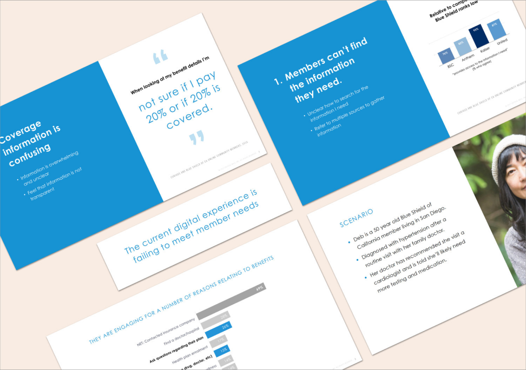
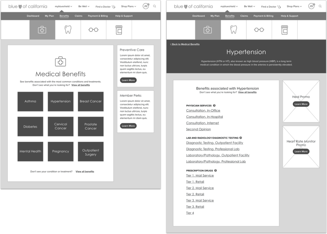
Short Term Vision
The immediate phase layered onto the existing experience, providing easy access to a curated list of benefits for the most frequently searched conditions and introducing more human-friendly language. A pragmatic first step toward a dramatically better experience.
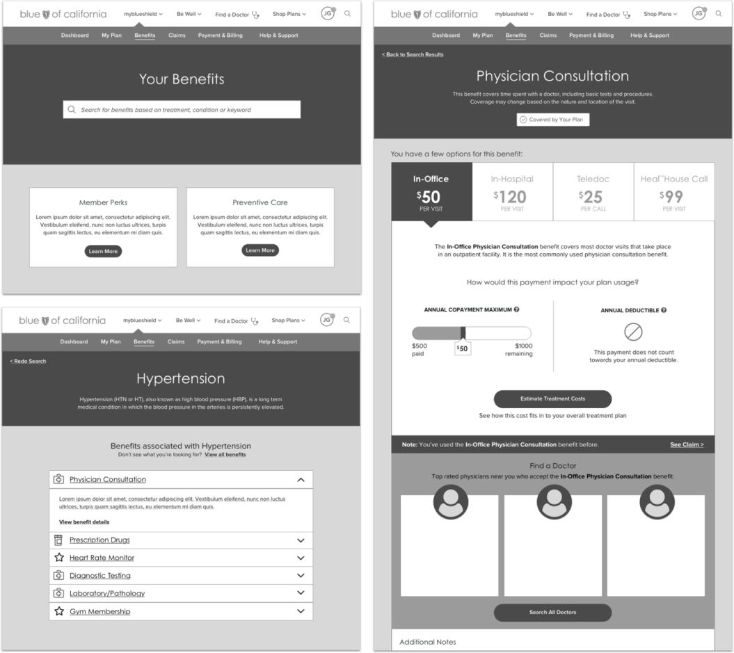
Medium Term Vision
The next phase proposed robust search capabilities, simplified categorization, and contextual information connecting claims, doctors, and member perks into a more cohesive experience.
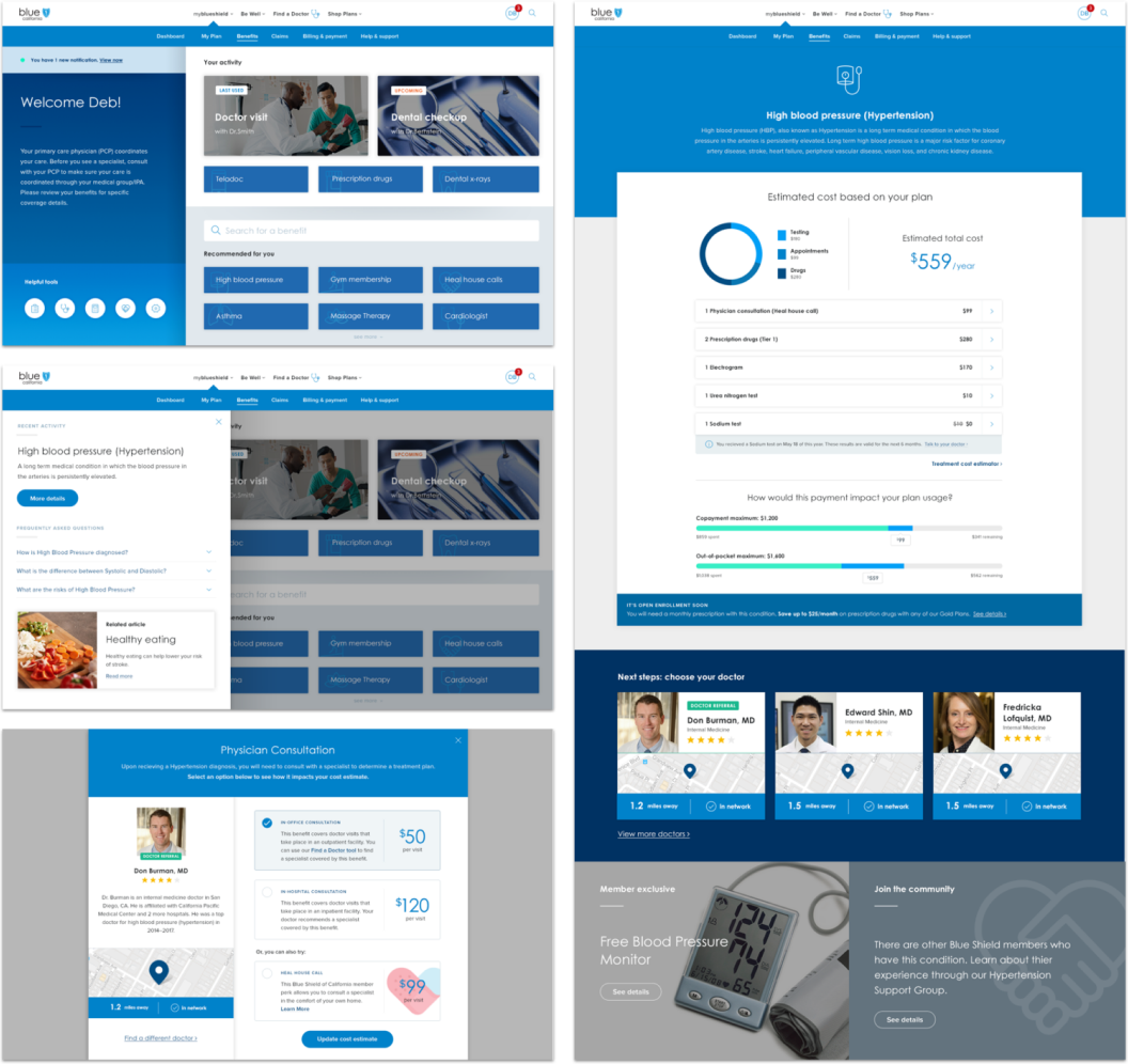
Long Term Vision
The long term vision represented the ideal: simple, human, and intelligent, designed around member needs rather than legacy backend structures. We paired the design with a strategic roadmap showing how incremental improvements could evolve the experience toward this ambitious destination.
RETROSPECTIVE
What I'd Do Differently
[FILL IN: 2–3 specific sentences. How you'd sequence the research differently, how you'd involve Blue Shield earlier in the strategic reframe, what you'd change about how you presented the roadmap, or something that didn't land as expected. Specific beats general — “I'd run a benefits card-sort with members in week one before the architecture was locked” is specific. “I'd communicate more” is not.]